


- No products in the cart.
- ``
Pantone Colours: How to light the 2021 colour of the year

03
Aug
Pantone’s colour of the year has been revealed: PANTONE 17-5104 Ultimate Gray and PANTONE 13-0647 Illuminating. For over 20 years, Pantone’s colour of the year has influenced product development, purchase decisions and design in a number of industries, including lighting!
The selection process involves analysis of trends all over the world, understanding influences and the latest in design. The colour can be influenced by art collections, fashion, design, lifestyles, new technologies and more.

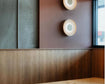
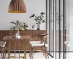
The use of colour is crucial to any interior design, and just as important is how you shed light on your use of colour. Creating the feeling or vibe you’re after through interior design is often achieved through carefully marrying both lighting and colour choices.
Ultimate Gray and Illuminating
PANTONE 17-5104 Ultimate Gray and PANTONE 13-0647 Illuminating are two independent colours that PANTONE has selected to highlight how different elements come together to support one another.
“Practical and rock solid but at the same time warming and optimistic, the union is one of strength and positivity… It is a story of colour that encapsulates deeper feelings of thoughtfulness with the promise of something sunny and friendly.”

Following a tumultuous 18+ months, the colours send a message of happiness supported by fortitude. PANTONE states the selection leads us to believe that everything is going to get brighter, an essential part of the human spirit.
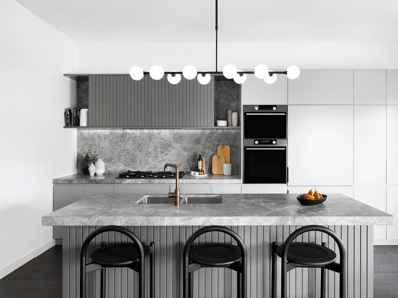
About Space’s Lighting Choices for Pantone’s 2021 colour
We came together to review the colour of the year, and how we’d be inspired by it. Here are some of our selections for you to draw inspiration from.

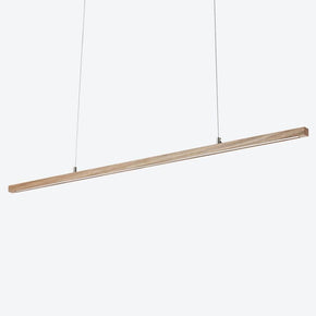
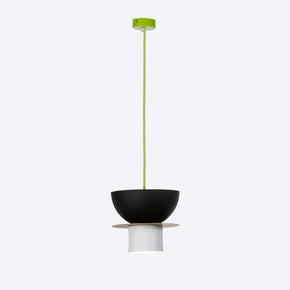
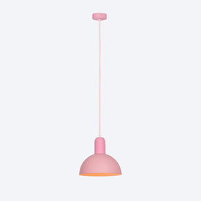
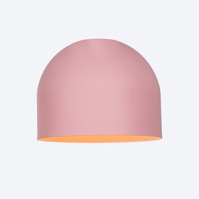
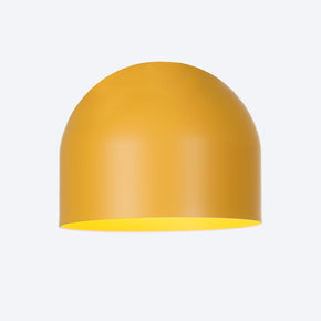
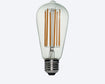
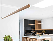
To complement the vibrant yellow and robust grey tones, we’ve chosen brass details, smokey glass and bold black finishes. A couple of fixtures we like are the Addi Table Lamp and Toledo Smoke Pendant Light. The brass features of the Addi provide subtle hints of the Illuminating colour, and the smokey glass finish of the Toledo adds depth to any space.

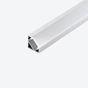
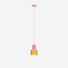
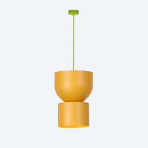
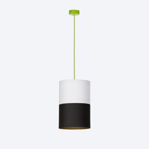
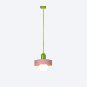
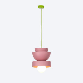
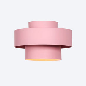
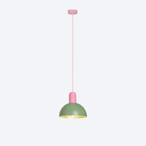
Shop: Aculypse Pendant

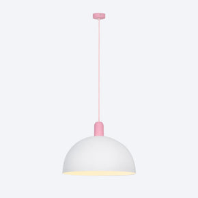
Shop: Xena Pendant
Lighting your colour palette
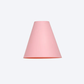
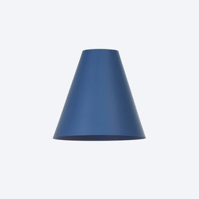
The temperature of your lighting is important when working with colour. Whether your space has a monochromatic scheme or a blend of natural shades, colours lighter in tone will need a lighting setup with corresponding blue/white temperature to maximise that vibrancy - think Ultimate Gray. On the other hand, when your colour palette has those natural, earthy reds, yellows and oranges, these rest well under warmer light - think Illuminating.

Temperature and Colour Management
The coolness or warmth of your lighting is a popular method of defining space in interior design. The ‘K’ or Kelvin of our lighting can have a huge impact on our mood and the associated emotions we’re likely to feel in certain environments. The higher the K, the more blue the light becomes. This is typical in galleries or offices where a high degree of either concentration or attention to detail is required. The lower the K, the warmer the lighting and this is typical in homes and restaurants.

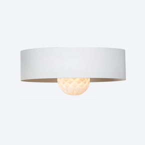
Shop: Dante Wall Light
Allow your space to show its true colours
If you need advice on which lighting solutions can complement your colour palette, get in touch with the About Space team. We can guide you through picking the perfect light to illuminate your space and make your colours stand out.
Image Sources: About Space, Pantone, Larforma, HeyDjangles, HomeStratosphere, Home Designing