


- No products in the cart.
- ``
Shedding a little light on CRI

09
Sep
Forget fixtures and fittings, the way you light a room can be just as important to ambience and atmosphere.
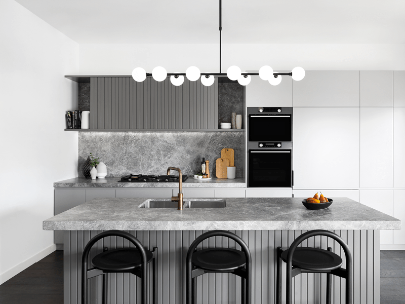
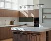
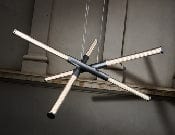
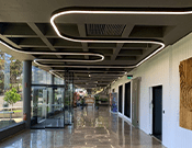
Lighting plays a huge role when it comes to the feel of a room. Next time you’re creating that special space in your home, shop or business, think of lighting as the fourth element of good design; turning colours and textures into a vibrant palette of finishes and materials.
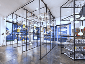
The way that colour appears within an interior is a key element of good design and for certain applications, the accuracy of colour is vital. From fashion retailers, who want to achieve a ‘true’ colour rendering for their merchandising, to grocery stores who know good lighting can add vibrancy and freshness to the produce on display – lighting is key.
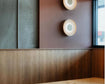
Get the lighting right, and colours burst into life, textures stand out, and finishes have a new sense of depth and vibrancy. But just what is a CRI rating and how can you use this scale to ensure you’re choosing the correct LED bulbs? Well, let us explain.
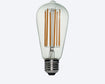
What is CRI?
CRI stands for Colour Rendering Index and every lamp, be it halogen, incandescent, CFL or LED, has a CRI rating between 0 and 100. The closer to 100 you get, the better that lamp will be at showing the true colours of the objects it illuminates.
How does CRI rating work?
CRI is determined by comparing the appearance of a coloured object under an artificial light source to its appearance under natural light at 100 CRI. The higher the CRI, the better the artificial light source is at rendering colours accurately. The lower the CRI value, the more unnatural colours appear when illuminated by the light source.
How does CRI affect your lighting?
If your lighting sources have a low CRI score, the colours of your interior design – including the walls, furniture and soft furnishings – won’t appear as they should. In order for the colour of your furniture and furnishings to appear as ‘true’ as possible, you want to achieve a CRI closer to 100.
In many cases, getting an accurate rendering of the colours in a space isn’t that important. But for certain applications, such as illuminating art or comparing fabric in retail clothing stores, CRI can make all the difference.

How to choose the right CRI for your space
This will depend on the space you're working with. If you’ve spent considerable time, money and effort to create a visual masterpiece, you’ll want the colours in your space to pop. Equally, if you’re displaying artwork or furniture pieces that deserve to be rendered in their truest colours, a high CRI will be important.
Generally, a CRI above 90 is considered high - pick lighting with a CRI above this when you need to illuminate your space to achieve high colour quality.
CRIs between 80 and 90 are considered mid-range, while anything below 80 is considered low and these lights should only be used when colour quality is less important.
If you're unsure, the best course of action is to sample different lighting solutions in the space to see exactly how they look.
If you need advice on choosing the right CRI lighting solution for your space, get in touch with the About Space team. We can guide you through picking the perfect light to illuminate your space and make your interior design stand out.