


- No products in the cart.
- ``
How to choose the right lights to complement your colour palette

11
Mar
When it comes to interior design, choosing paint colours and décor are often at the forefront of the planning process. Creating a feeling or a vibe through interior design is often achieved with the use of colour – but how can you get the most out of your colour palette? We can shed a little light on it.
As the old adage goes, just as the tree falling in the woods with no one around to hear it, interior design is just as silent without the best possible lighting setup. Read on for our guide to choosing the right lights to optimise and compliment your colour palette.
CRI rating and quality of colour
The appearance of colour goes hand in hand with the experience of the room. Whether the goal is to showcase products, highlight artwork and décor, or simply create that ambient atmosphere, the CRI rating is what lights the path to achieving it.
Put simply, the CRI (or Colour Rendering Index) rating represents how accurate the colours are being illuminated by the lighting. Measured between 0 and 100, the higher the rating, the truer the colour will appear. However, a low CRI rating will make those vibrant colours you spent all that time choosing to appear dull and lifeless. The quality of colour rests on the lights’ CRI rating and, of course, the lighting configuration.
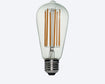
Every light bulb carries its own CRI rating, which creates the task of choosing between the many available options for your next project.
What CRI rating should you aim for?
CFL (compact fluorescent lamps), LED (light emitting diodes), halogen and incandescent lights will all differ in their CRI ratings. Typically, a high rating is what you’ll want to make those colours burst in your business or home, though this is more crucial for commercial purposes. For businesses, accurately rendering the colours of fabrics, food and furniture is critical. We’ve all asked ourselves, “is that black or navy?” at some point, and the aim here is to remove all doubt.
When it comes to your home or workspace it is more a case of mood and ambience that should be considered when choosing your lights.
As a general rule, CRI’s between 80 and 90 are considered mid-range. Where colour quality is more important, we recommend lighting solutions with a CRI rating between 90 and 100. In cases where colour accuracy is unimportant, lights with a CRI rating below 80 are considered more appropriate.
When choosing the best lighting solutions for your next project it’s also vital that the colour temperature is considered.
The impact of colour temperature
The colour of light is perceived as somewhere between the hues of yellow and blue on what is known is the Kelvin scale. With warmer tones appearing more yellow in colour (a candle, for instance) and cooler tones appearing closer to white or blue, the temperature itself is measured in units of kelvin (k). Lights ranging between 2000k to 3000k will produce a warm glow, while lights that are 4000k and upwards tend to emit a much cooler white tone.
Keep in mind, colour temperature refers only to the appearance of the light, rather than the physical heat given off by the bulb itself. This is definitely a good thing, as 2000k is equal to roughly 1726° Celsius. That might be a little too hot to handle! In actuality, what is described as the visually “cooler” light is in fact hotter in temperature.
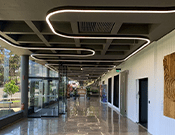
Matching the colour temperature of your lights to the purpose of the room will have an impact on mood and atmosphere. In a home you might choose a more comfortable, warm colour temperature, whereas in a retail store or workplace opt for a much cooler white light due to its ability to improve productivity.
Lighting your colour palette
The colour temperature of the lighting is generally either towards the warm or cool side of the spectrum, but never mixed. Consistent lighting allows the users of a space to really feel the vibe you’ve worked so hard on creating. Your colour palette will also fall somewhere between warm and cool and matching it with the appropriate lighting is key.
Whether your space has a branded monochromatic scheme or a blend of natural shades, colours lighter in tone will need a lighting setup with a corresponding blue/white temperature to maximise that vibrancy. These mostly include blues, greens and purples.
On the other hand, when your colour palette has those natural, earthy reds, yellows and oranges, these rest well under warmer light.
Allow your space to show it’s true colours
We know how much care and thought goes into interior design and the importance of colour in any space. Finding a lighting solution that does justice to the colours you’ve chosen will allow the space to be experience exactly the way you intended.
If you need advice on which lighting solutions can complement your colour palette, get in touch with the About Space team. We can guide you through picking the perfect light to illuminate your space and make your colours stand out.